Role
Visual Direction, Brand Strategy, Product Design


THE CHALLENGE
Young people today are looking for energy without compromise:
No sugar, no fakes, no outdated vibes.
But most snack and energy brands still speak in overly masculine or clinical tones.
No sugar, no fakes, no outdated vibes.
But most snack and energy brands still speak in overly masculine or clinical tones.

Audience Insight & Visual Positioning
Our audience is bold, expressive, and movement-driven.
They seek brands that fuel both body and identity.
They seek brands that fuel both body and identity.

Solution
We created PowerMi—a plant-powered, design-forward energy brand made for Gen Z.
Through kinetic graphics, bold typography, and rhythmic messaging, PowerMi inspires daily motion and self-expression. From packaging to social media to motion assets, the brand creates a visual system that’s as energetic as its users.
Through kinetic graphics, bold typography, and rhythmic messaging, PowerMi inspires daily motion and self-expression. From packaging to social media to motion assets, the brand creates a visual system that’s as energetic as its users.

Brand Concept

Visual Keywords

Moodboard: Logo

Moodboard: Visual Language
VISUAL LANGUAGE
Custom logo with rhythmic motion lines
Colour palette: Forest green, cobalt blue, citrus orange
Fonts: Sugo Pro for headlines, Lato for clarity
Symbol library representing energy, motion, rhythm
Taglines: FuelMi. MoveMi. BeMi.

Brand Presentation Board
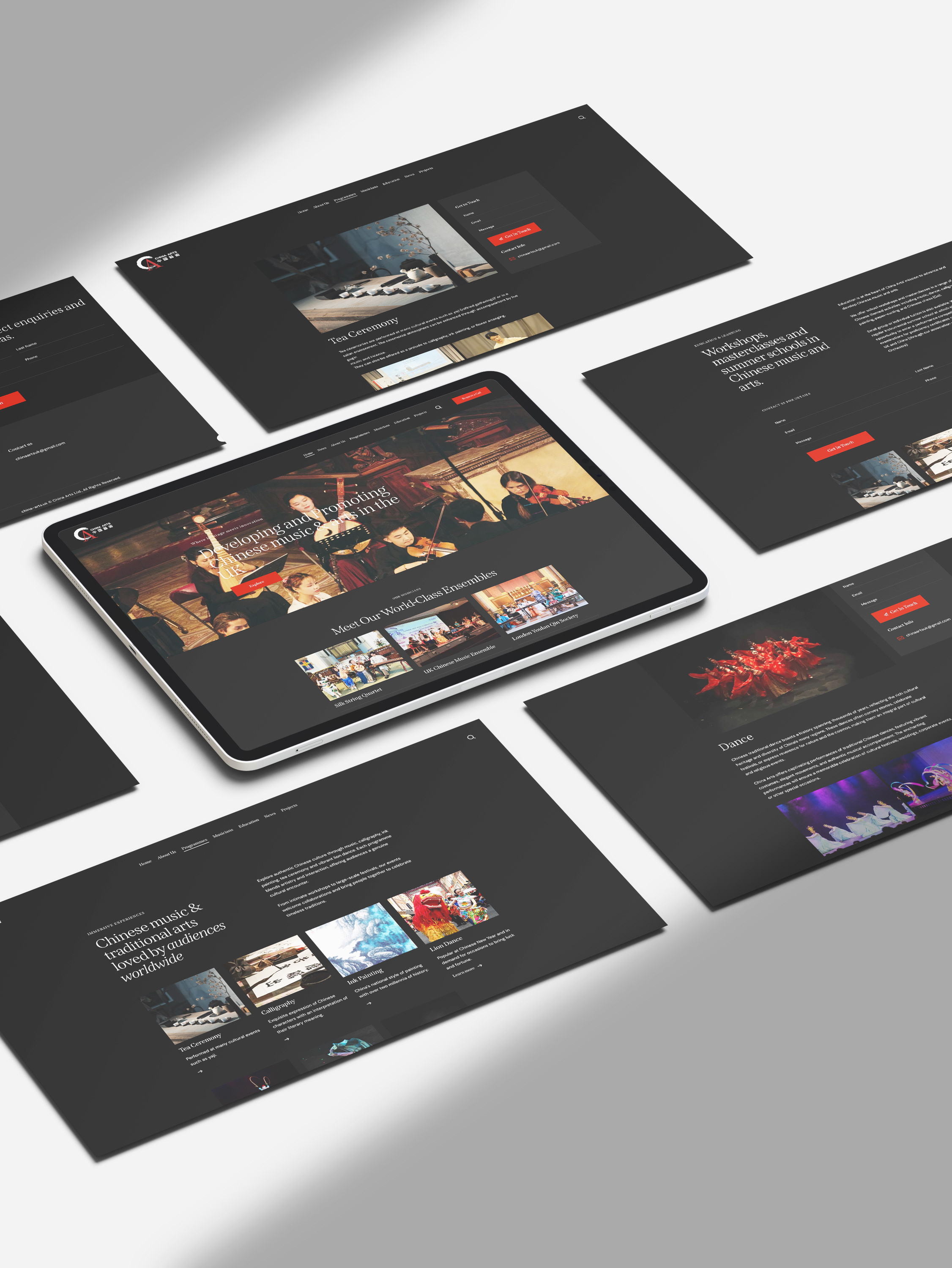
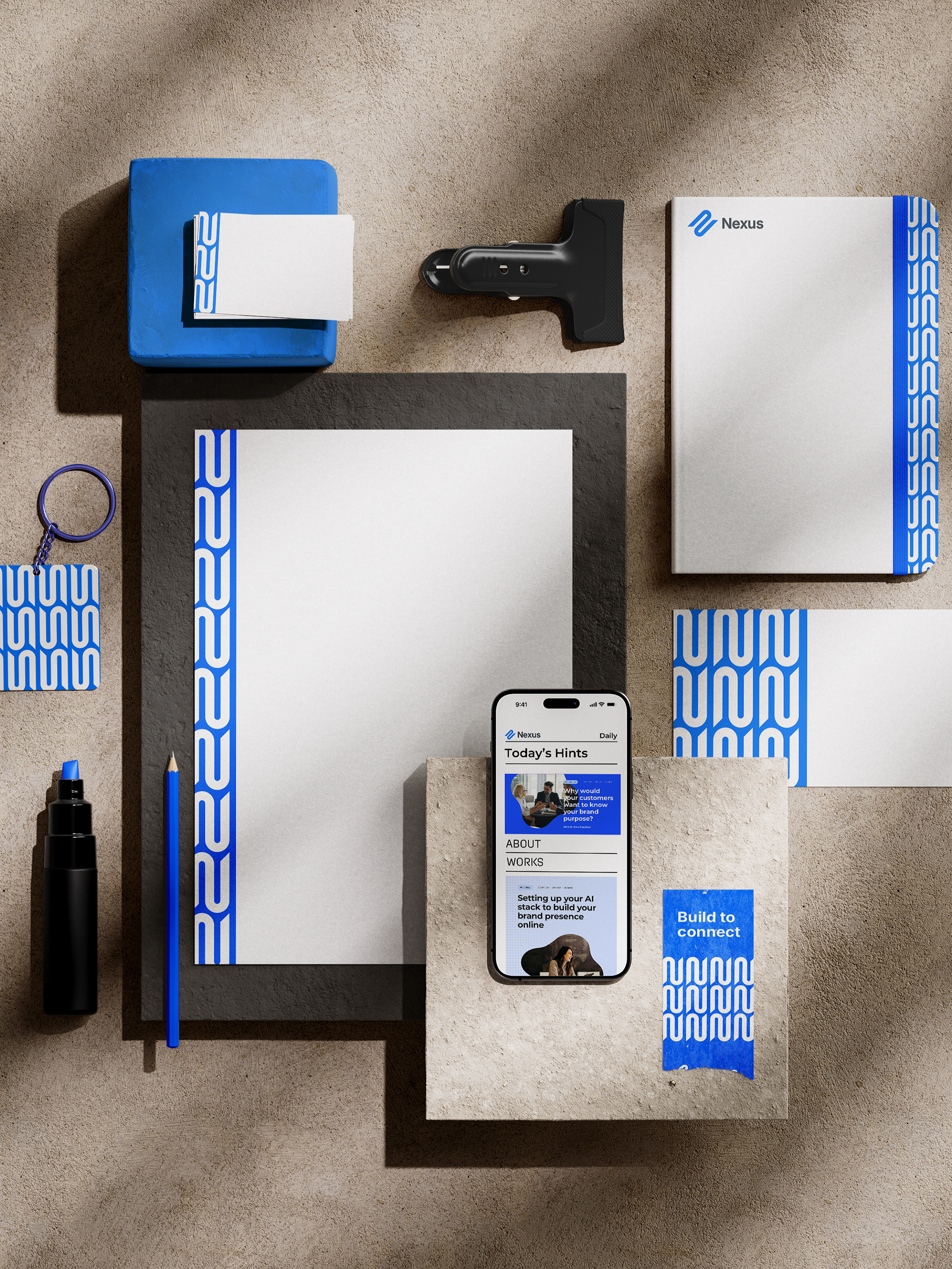
Applications
Our designs span across posters, motion graphics, packaging, and merchandise.
Each touchpoint builds a cohesive, high-impact brand system with strong campaign adaptability.
Each touchpoint builds a cohesive, high-impact brand system with strong campaign adaptability.
Results
The final system expresses PowerMi’s mission in a bold and rhythmic way
—fueling daily movement with zero sugar, all attitude.
—fueling daily movement with zero sugar, all attitude.

TOOLS
Figma | Illustrator | After Effects | Instagram