Overview
Over two consecutive years, I led the branding and visual system for a major cultural music event in London.
The 2024 and 2025 identities explored minimalist elegance and rhythm-based motion, respectively — across posters, digital backdrops, and printed programmes. Strong typographic pairing and bilingual layouts ensured clarity and cultural sensitivity.
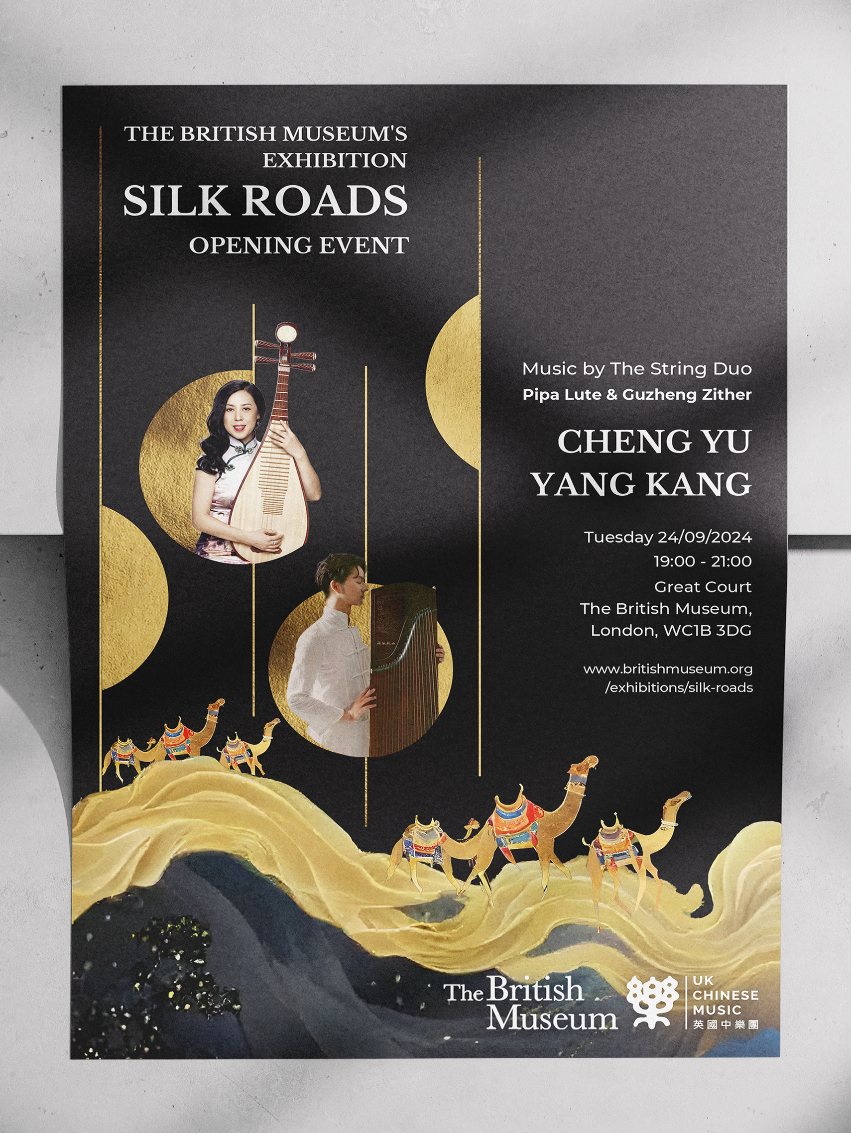
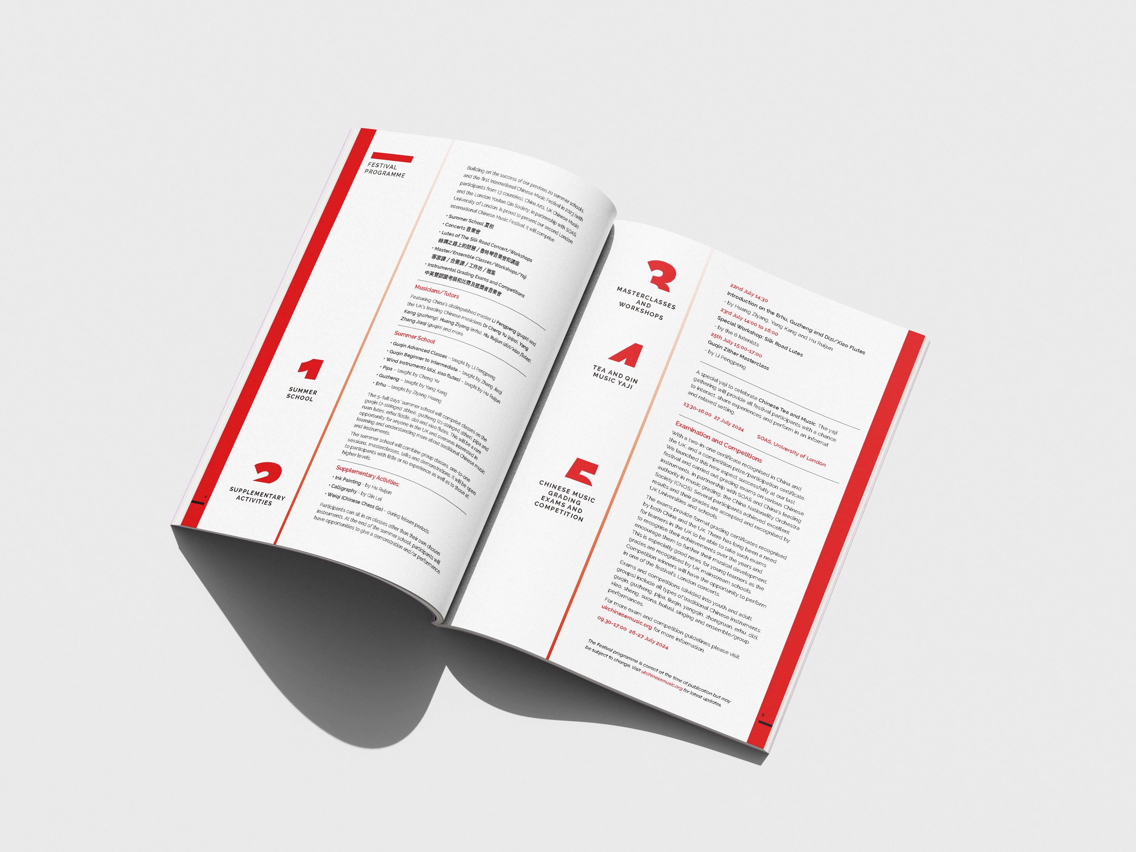
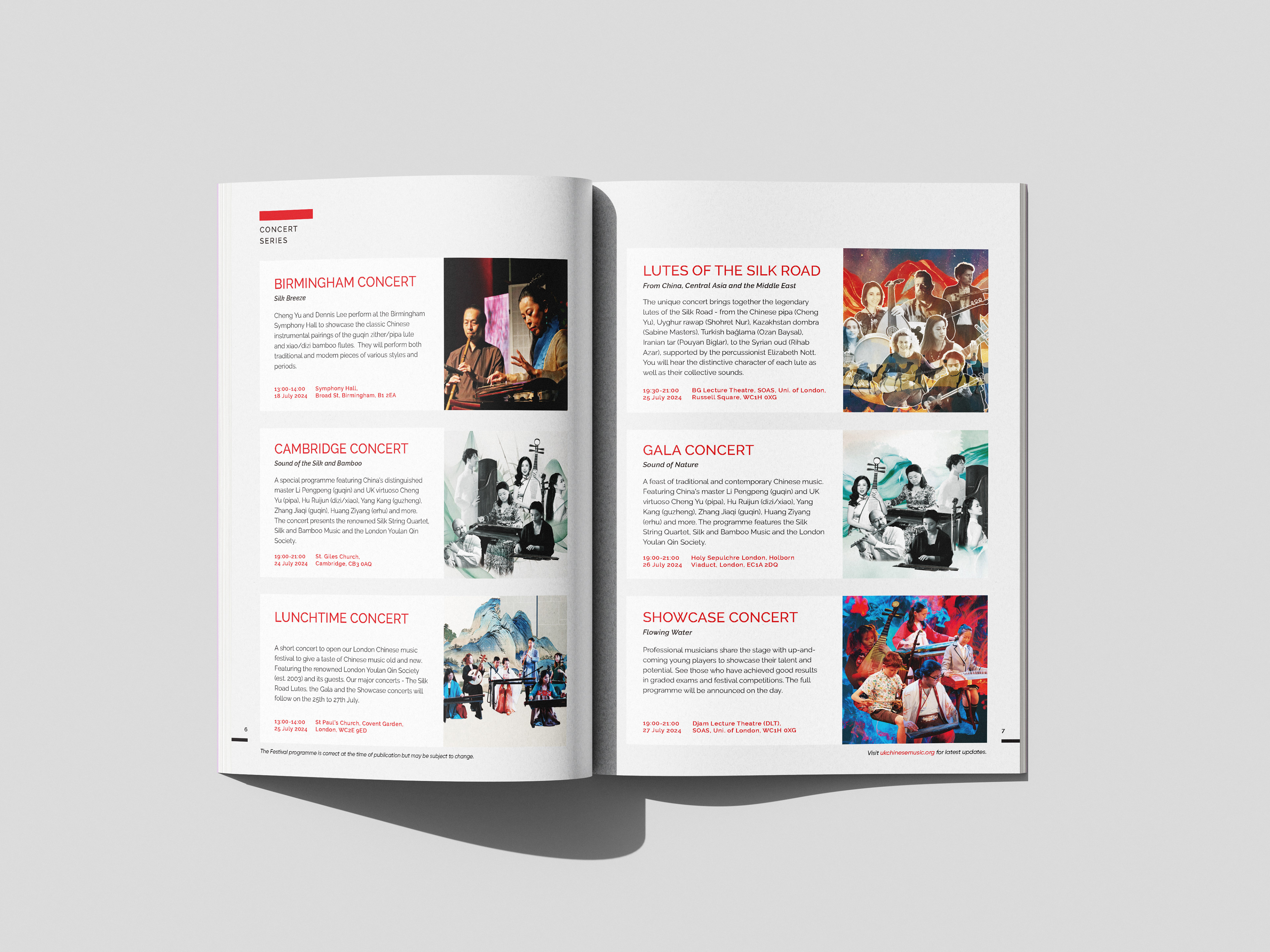
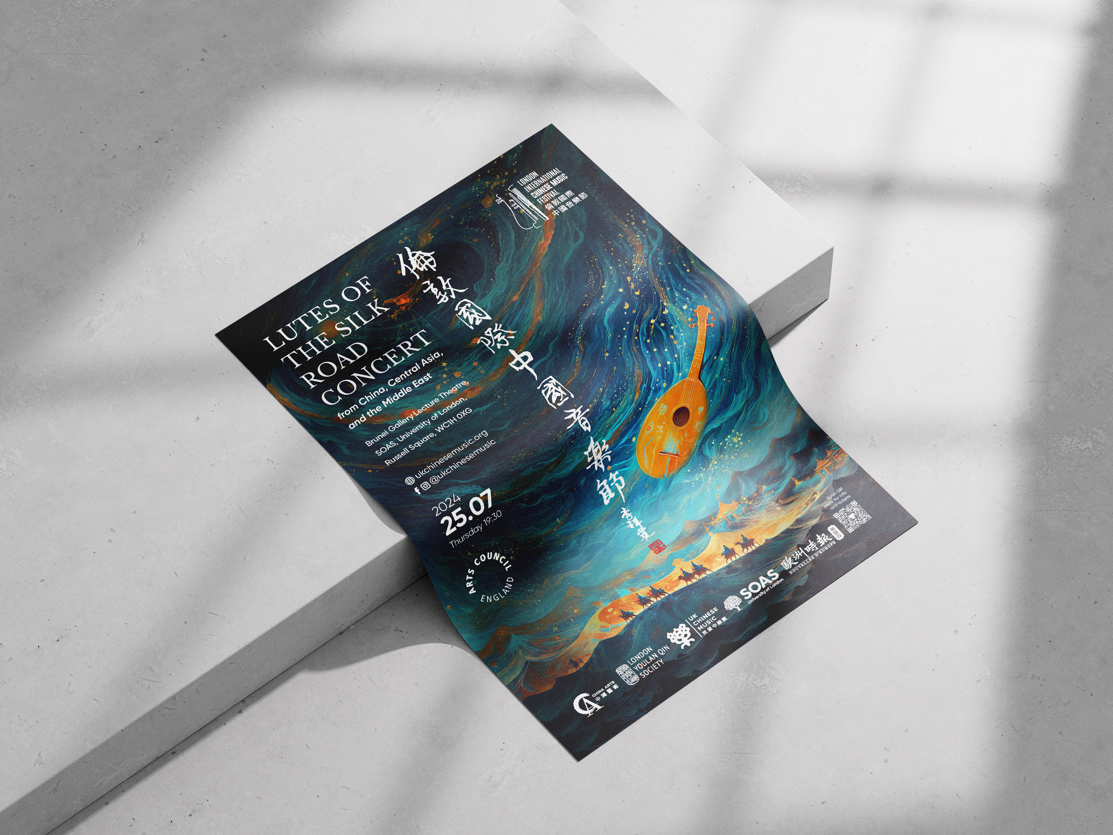
2024 Festival – Elegance in Simplicity
A refined visual identity inspired by traditional Chinese aesthetics
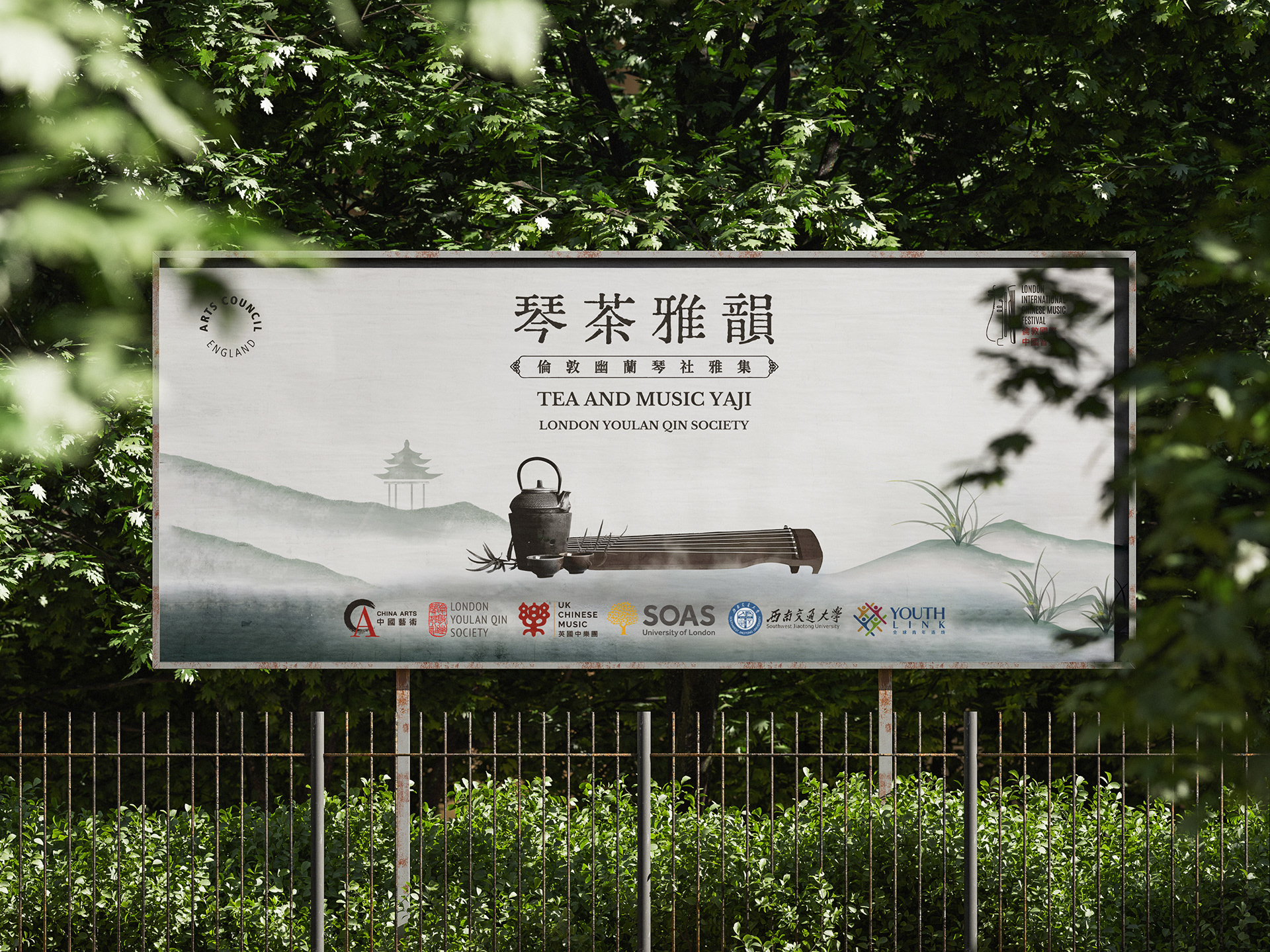
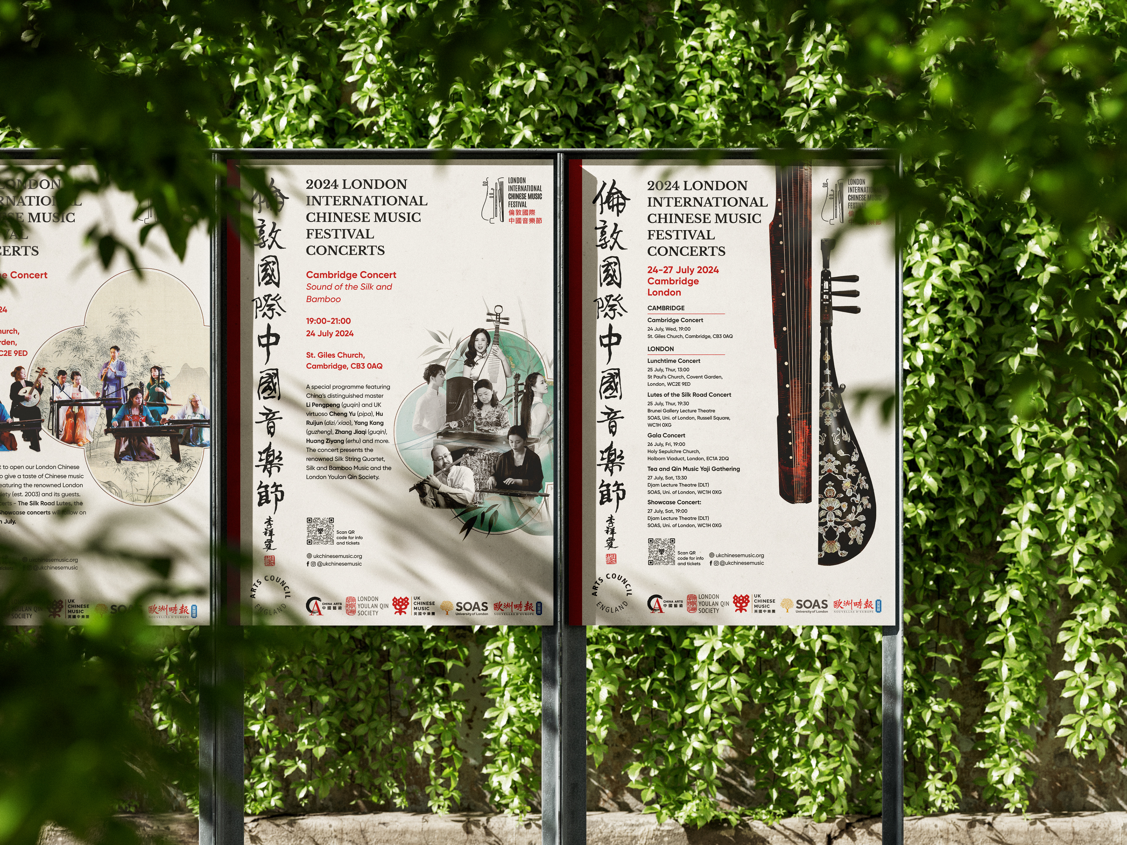
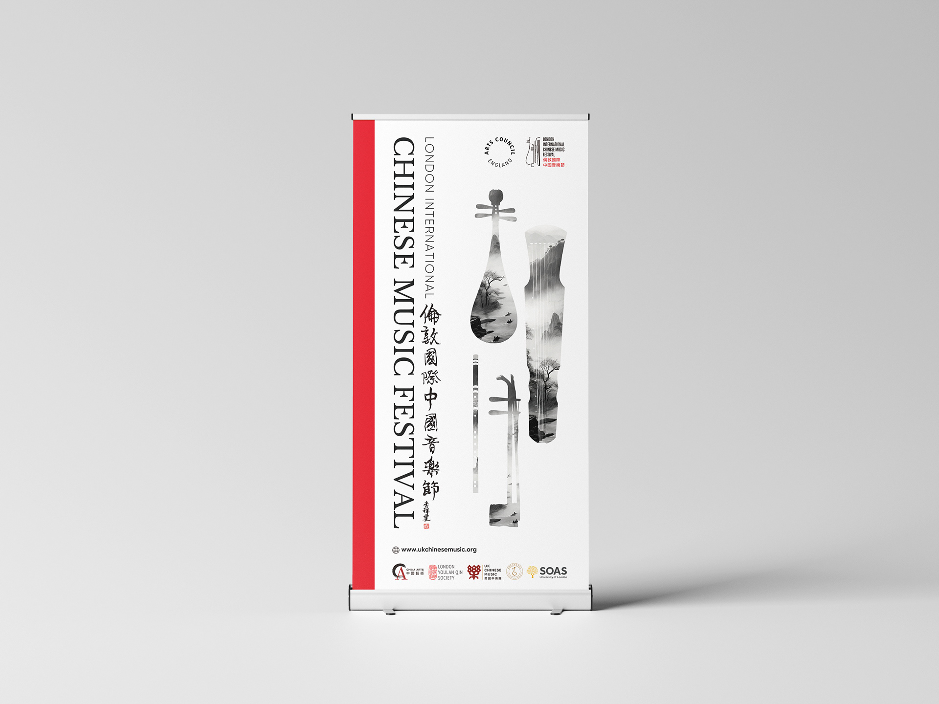
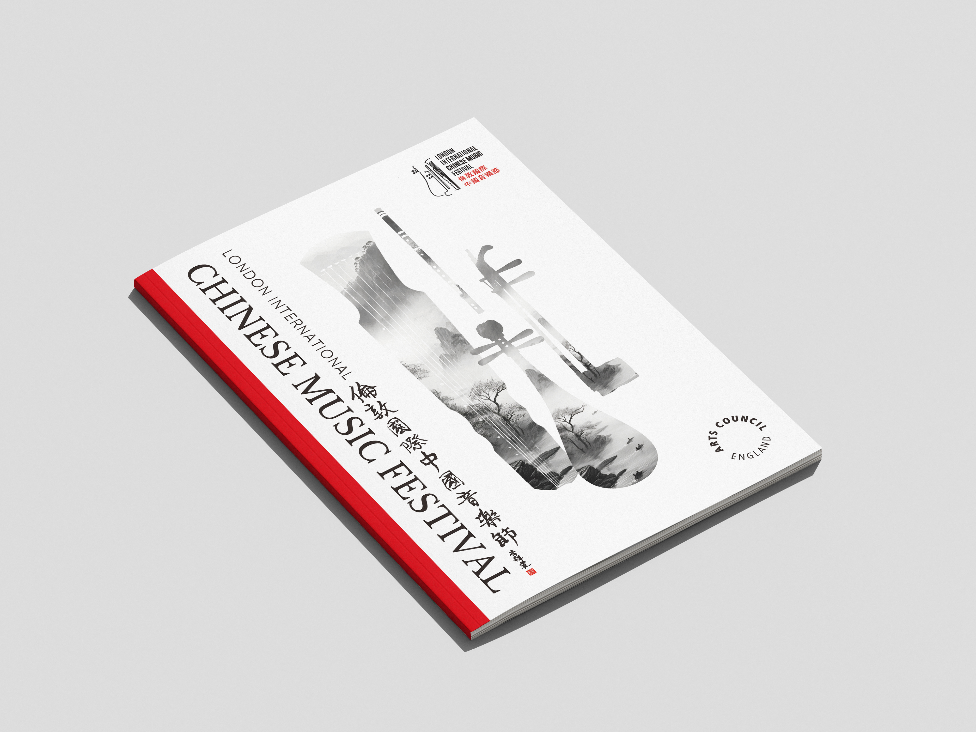
The 2024 edition focused on balance, restraint, and cultural symbolism, using a minimal red, black and white palette with generous use of negative space.
Brushstroke and ink motifs — referencing landscape painting and classical calligraphy
Colour palette — red (vitality), black (depth), and white (harmony)
Instrumental abstraction — curves from guqin, pipa and dizi formed the foundation of the logo and poster system
Typographic balance — a harmonious pairing of Chinese and English typography, readable yet refined
This identity prioritised serenity, elegance, and quiet symbolism—allowing space for the music to speak.
Process & Thinking
Research: Explored cross-cultural themes, visual codes of Chinese tradition, and audience expectations
Strategy: Defined evolving themes each year—2024 as “Reimagining Tradition,” and 2025 as “Energy in Flow”
Design: Developed flexible visual systems adaptable across print, digital, and motion

Outcome
Both years’ identities successfully captured the festival’s evolving ethos.
2024 invited audiences with elegance and peace
2025 drew them in through emotion and resonance
Together, they express the depth and rhythm of Chinese music in visual form.
Together, they express the depth and rhythm of Chinese music in visual form.