concept
Feast Festival is a celebration of food, wine, and community along the stunning Cornish coastline. The heart of the campaign was to capture the artisanal spirit of the event while reflecting the joyful, seaside vibe.
It’s not just about what’s on the plate or in the glass—it’s about the moments shared, the stories told, and the joy of discovery through flavour.
INSPIRATION & THINKING
• Seaside charm meets artisanal flavour — Hand-drawn illustrations echo the festival’s location and local craft.
• Family-friendly playfulness — A bright, coastal colour palette invites all ages to join the fun.
• Connection through storytelling — Each design element tells a story—from lobster to lemon, cocktail to parasol—celebrating the makers and the memories made.
Approach
Aimed to design a visual identity that radiates warmth, curiosity, and celebration.
Every asset—from posters to merch—was infused with a hand-crafted feel and a strong sense of place, tying together community, cuisine, and coast.
Process
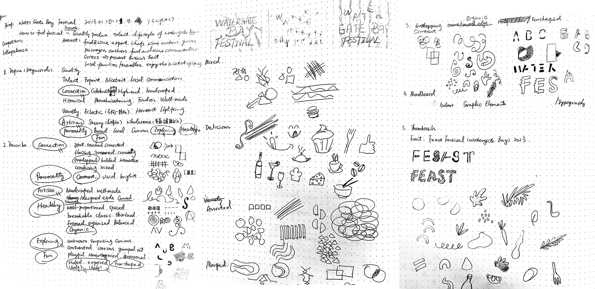
Research
Immersed in the festival’s history and local culture to extract themes of craftsmanship, connection, and seaside joy.
Strategy
Established the festival’s message: “celebrating connection through food, wine, and shared experiences.”
Design
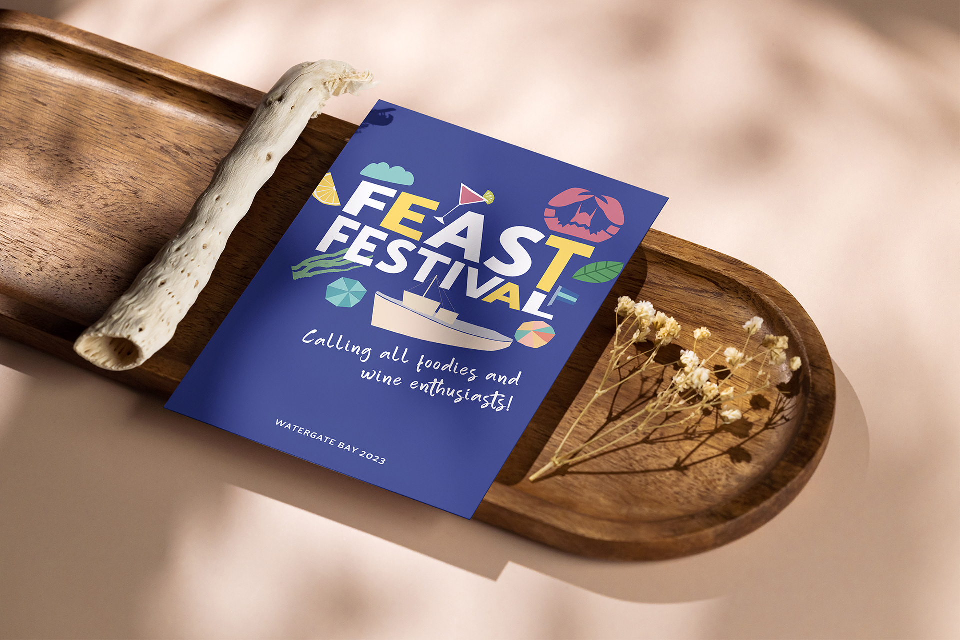
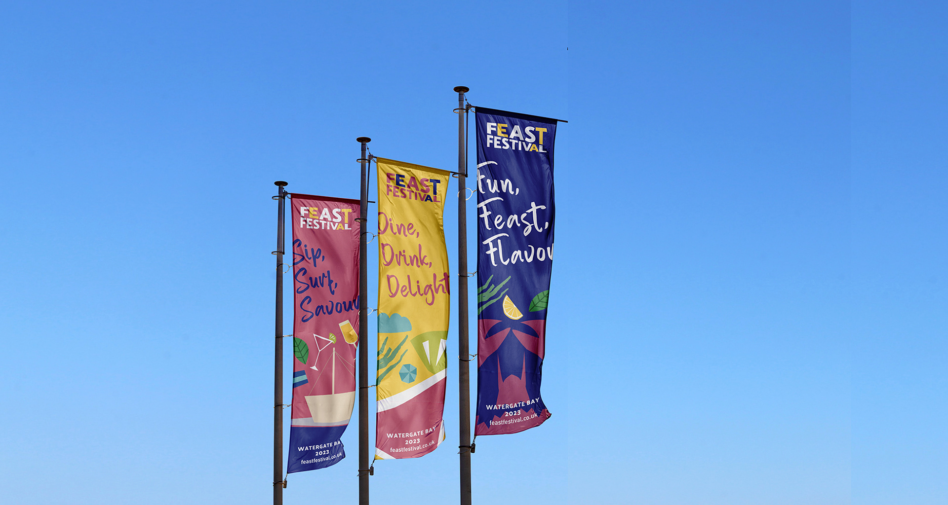
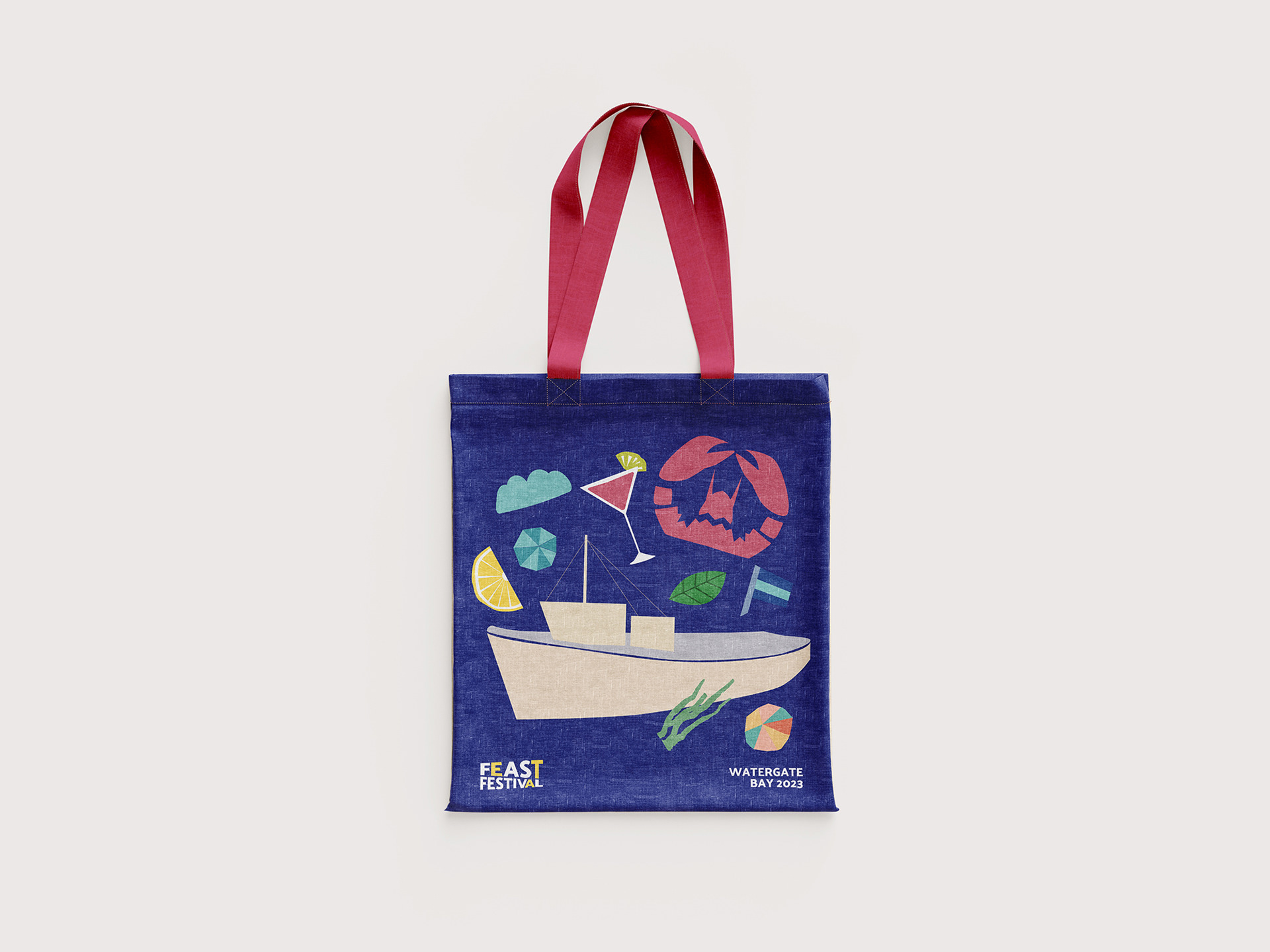
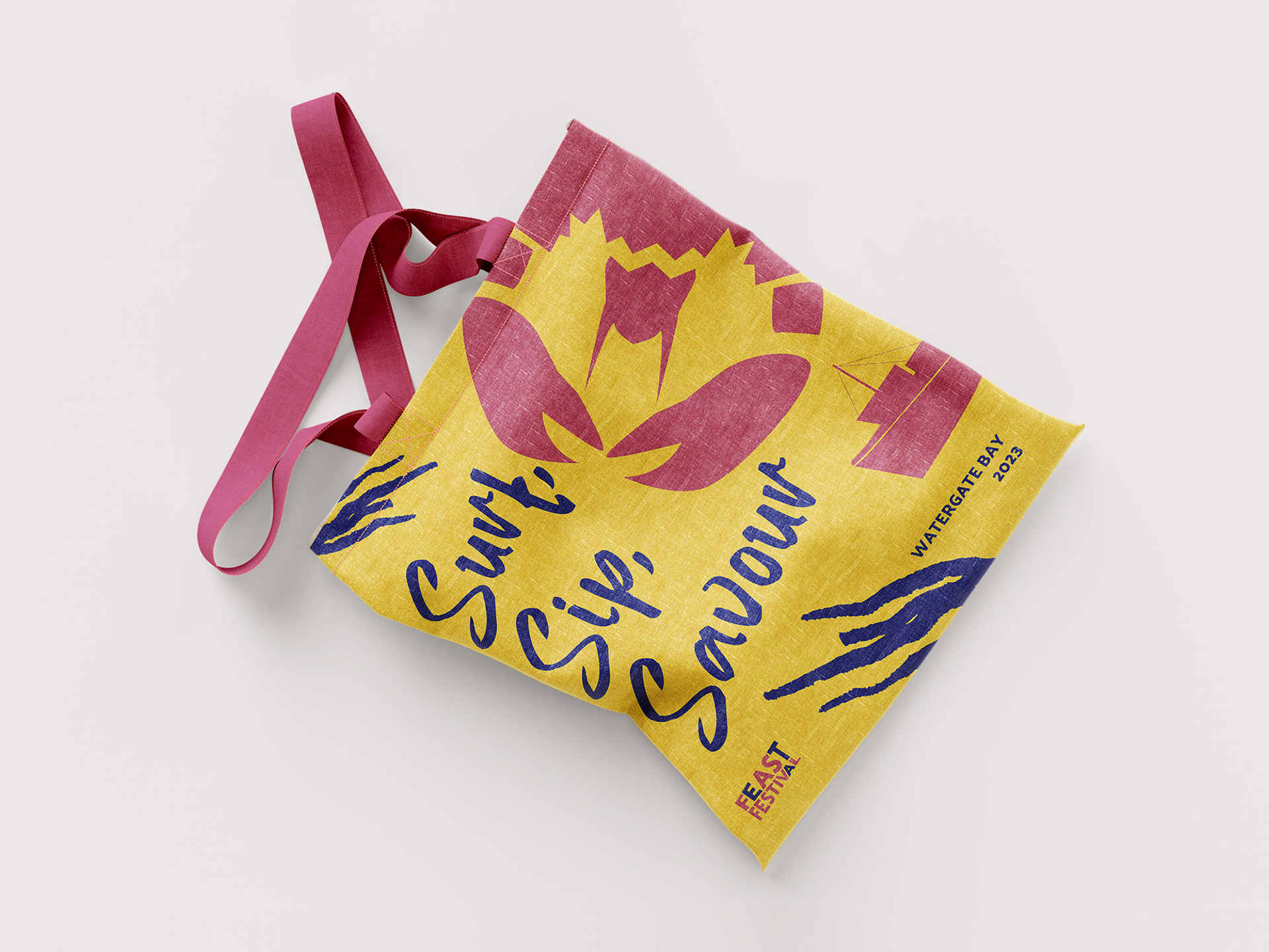
Illustrated playful elements inspired by coastal life—lobsters, cocktails, mint leaves, parasols, sailboats, lemons, seaweed.
Created a soft yet energetic colour palette of sandy neutrals, sea blues, and zesty accents.
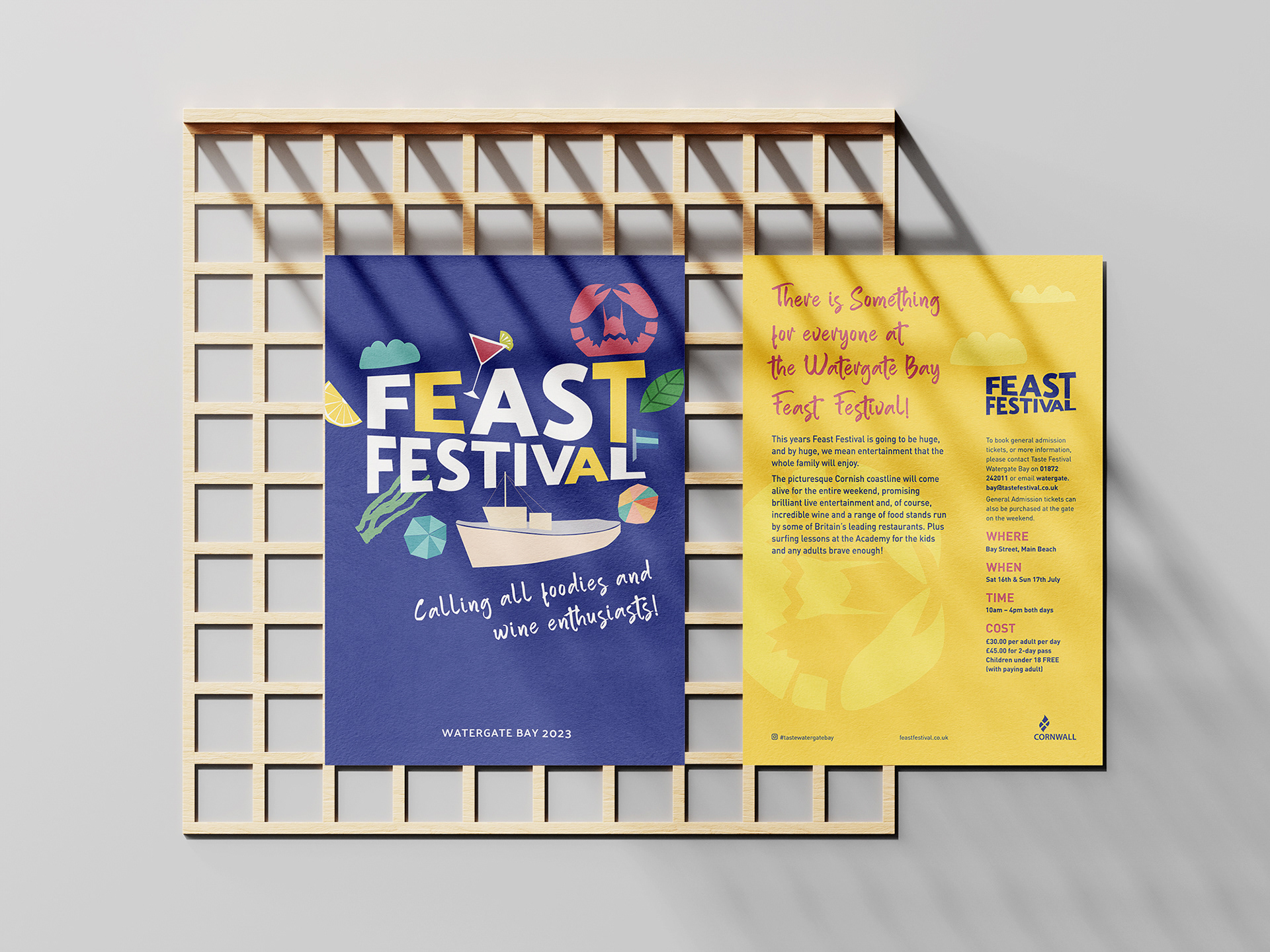
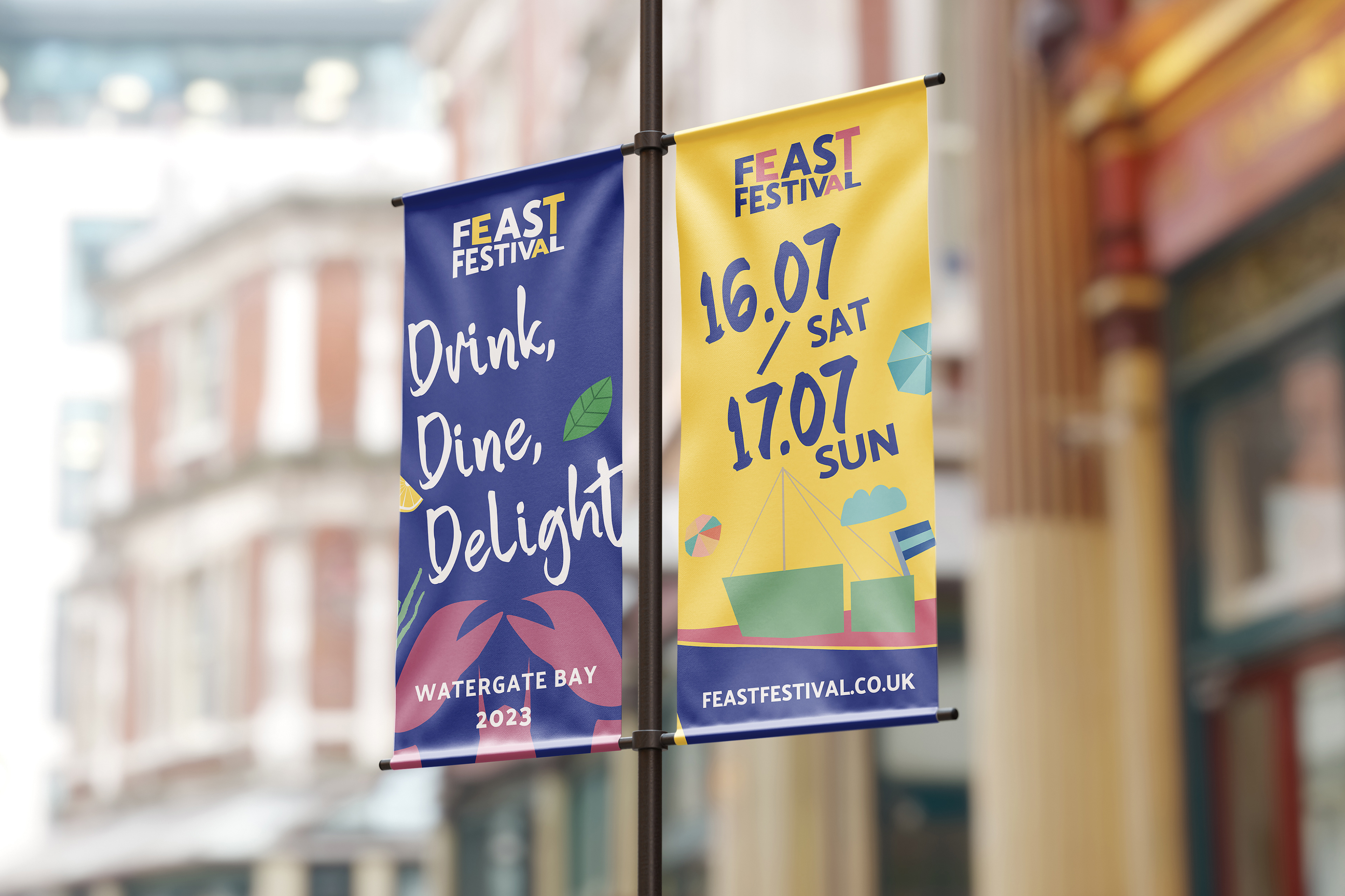
Built a visual system adaptable to signage, social media, menus, and merchandise.
Implementation
Rolled out the brand across digital and print touchpoints—ensuring that every interaction with the brand felt vibrant and consistent, from the first announcement to the last bite.
SWEET SPOT
The emotional hook came from blending the handmade with the heartfelt—every illustration invited people to feel part of the story, whether they came for a glass of wine or a day with family.
KEY DELIVERABLES
Visual Identity: A playful, coastal-inspired logo system and illustration set
Illustrations: Hand-drawn assets reflecting the local flavour and beach vibe
Brand Colour System: Soft, seaside tones with pops of energy
Print Collateral: Posters, maps, menus, signage
Merchandise: Branded tote bags, badges, and festival wearables
Digital Assets: Social media banners, website graphics, newsletter templates
Outcome
The branding created an instant sense of place and purpose, attracting food lovers, families, and curious travellers alike. The illustration-led visuals became a talking point of the event, enhancing the visitor experience and strengthening the festival’s identity as a joyful, communal celebration.